1 Think ‘about’ the fold
With all the debate swirling around blogs and magazines about the importance or non-importance of the fold, when you’re designing a landing page please consider using it to your advantage.When I design landing pages I don’t try to cram everything above the fold and clutter up the top 500 pixels of my design, but I do like to design so that images, headlines or text teeter on the line. This creates a ‘teaser’ for the user to scroll down more and check out the rest of the page.
I personally believe that most users scroll anyway when a page loads, it’s almost reflex, but this doesn’t mean that they see or read everything below the fold. It’s more of a quick ‘size up’. If the page looks too long they may get chased away. So put things below the fold that are eye catching. A lot of designers will put all the cool graphics above the fold and then bury large blocks of boring text below the fold. If the user does a quick scroll down and sees all of that boring text, they might get scared and leave your page.
2 One clear call to action
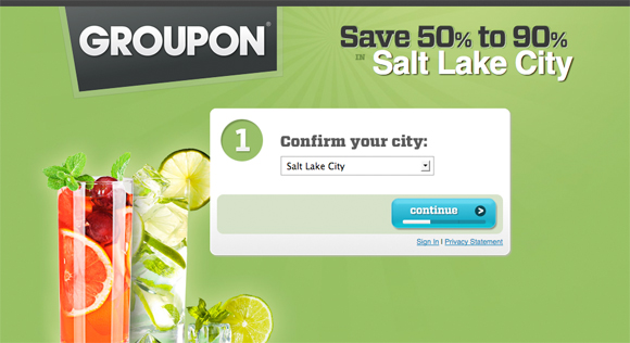 Only have one, very clear call to action. Don’t muddle up your page with too many things that will distract the user from the main purpose of the landing page. Distraction is a huge factor when designing a landing page, and all too often we like to make our landing pages so beautiful that the call to action gets lost.
How to focus your call to action:
- Ask the user a question.
- Use graphics, arrows or visual direction to guide the users eye.
- Call to action should be at the top of the page.
- Make sure the color of your call to action is not used anywhere else on the page.
- Condense your call to action to one sentence or question.
- Place call to action on a simple background to allow it to stand out.
- Simplify your text, simplify your text, and then simplify your text.
3 Visual cues – remove the heavy text
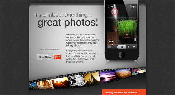
When designing your landing page try to use more visuals and less text. I try to stick to a 60/40 split, where 60% of the page should consist of a visual cue and 40% is text. Images and graphics will get the user’s attention, you only have a few seconds to grab it, so make it count.I prefer to use a more ‘infographic’ or heavy graphic approach to visuals where I can combine text and graphics together. Infographics are very easy to look at and understand. If done correctly, this can convey your message very effectively.
A very good example of this is Camera+:
Nobody likes to read text, especially small text or even fine print text. If you do need block paragraphs of text please use a friendly font size; no smaller than 14px. Try to break up your blocks of text as well, don’t just lump them all together in one big mass. If a user sees a giant glob of text they are likely to run away.
4 Button or form?
Okay, this can be a tricky question. Most of the time landing pages are the place where your user signs up for something, right? So you’ll need a form, right? Forms suck and nobody wants to fill them out, but they are a necessary evil to any and every landing page. So, do you just slap your form on the page? Or do you use a button that serves up the form? This really depends on your form. If your form is pretty short, say 1 to 3 fields than I say slap right on the page. Short forms are less intimidating and scary, so save your users the hassle of clicking on a button, just give them the form.Now, if your form is longer create yourself a nice call to action button and serve up the form in a modal window or some other visual presentation. If your form is super long, then I suggest you break it up into steps just for usability sake. A button can be tricky though because they are usually pretty small. Buttons need to stand out just like a large form box and enough to get the user’s attention. But if you treat a call to action button the same as you would any other call to action, then you’ll be just fine.
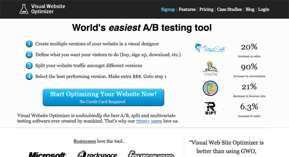
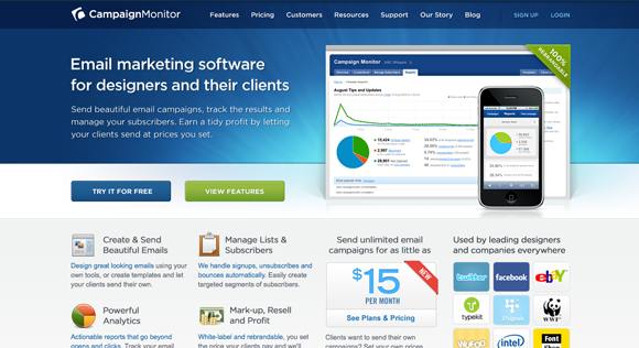
Here is a couple of good examples or landing pages that use only buttons, no forms:
5 Got links? Get rid of them
Remove all links other than your call to action, you don’t want your user leaving that page. My only exception to this rule is the privacy policy page which should always open up in a separate window. When your user hits your landing page you never ever want them to leave that page through that page. The user should only have two options; sign up or back out.If your landing page is a part of your over all site – which for a lot of products this may be the case – try to eliminate as much navigation as possible. Your site may offer more benefits to your product and so having the user navigate away from the landing page may be beneficial in some cases, but there are other pages you don’t want this traffic to see like your about page, contact page, forum or blog pages. If the user starts reading through these other pages they may get too distracted and never come back.
While these pages are great to have on your site and may support your product, they need to be very specific and related to your call to action. If any of these sub pages don’t support your overall call to action directly I would suggest you remove your navigation from your landing page.
6 Free always works
 It’s true, it always does. Almost any good landing page offers something free, whether it is a product, trial, service or just information, make sure that your landing page says free on it somewhere. Users like free, they feel less pressured or obligated when they see the word free so most of them are more likely to sign up when they have no monetary strings attached. Free is always an easy decision to make, so make it for them.
- No obligation
- No credit card required
- Complimentary trial
- No commitment required
- No charge
- It costs nothing
7 Provide security
Privacy is a huge factor on the interwebs these days, more so than just five years ago (I blame Facebook) and people are much more aware of security hazards on the web. Protecting the security of your users and letting them know you care about their privacy can be a very good selling point. In some cases it can be a breaking factor for conversion. If users don’t see a privacy policy or a security certificate they may just turn around and walk away. These extra security measures will allow your users to be more comfortable with your site.Every landing page should have these security items:
- An SSL certificate and HTTPS
- A visible SSL certificate logo, even if its only visible in the footer or below the fold
- A very visible link to your privacy policy
- A check box in the form indicating that they have seen the privacy policy
Related Articles:
10 Factors that Affect Your Bounce Rate22 Creative Landing Page Designs – A Showcase, Critique, and Optimization Discussion
Your Landing Page Sucks! Here are 10 Examples That Don’t…
The Anatomy of a Perfect Landing Page
Share and Enjoy:



No hay comentarios:
Publicar un comentario